
How Stencil and Storybook help build fast, accessible web apps with Web Components
Over the last couple of years, the demand for component-based architectures in the JavaScript space has grown significantly. There are a wealth of solutions available today, making it difficult for engineering teams to assess and invest in the best one for their needs. This becomes even more difficult when considering the essential aspects of web development — accessibility, performance, and inclusion.
In this article, I explain why we decided to use Web Components, with Stencil as a toolkit for building them and Storybook for their presentation. I use CovApp, our recently released, open-source web application, as an example, showing how these technologies helped us deliver fast and accessible web experiences.
What are Web Components?
Web Components are a set of web platform APIs that allow you to implement encapsulated, reusable, custom HTML elements. When we refer to Web Components, we usually mean the following specifications:
- Shadow DOM: A DOM feature that lets you define a scoped subtree in your HTML element, including style and behavior.
- Custom Elements: Which lets you implement new HTML elements.
- HTML templates and slots: Which lets you define reusable markup templates with placeholders (slots).
The good news for developers is that the most popular browsers support the key Web Components specifications.
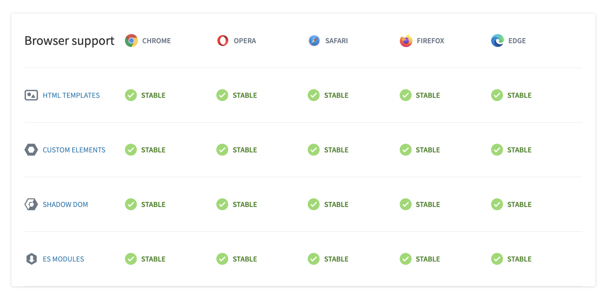
(Source: https://www.webcomponents.org/)
Which companies use Web Components?
Google was one of the first tech companies to adopt, and advocate for, the modern concept of Web Components with the Polymer Project. Google's backing, along with the stable release of APIs, helped popularize the idea in the web developer community.
Today, the adoption rate of Web Components looks promising. Tech giants like Apple, IBM, Mozilla, SAP, Microsoft, Google, and GitHub are integrating them to great effect.
Why we chose Stencil
One of our guiding principles when selecting a front-end framework or toolkit is to ensure it’s as close as possible to the web standards. Following the web standards helps us prioritize accessibility, cross-compatibility, and progressive enhancement as part of our development.
Since Web Components is a suite of several native Web APIs, we wanted to invest in them as a way of organizing and sharing code across various web projects.
There are several established solutions for creating or generating Web Components, including:
Each of these solutions has its own advantages and analyzing them isn’t within the scope of this article – though I recommend checking each solution out.
That said, here are the main reasons why we chose Stencil:
1. Framework-agnostic build-time tool
At its core, Stencil is a compiler that generates Web Components. You can decide in which context you’d like to integrate them, such as in a specific JavaScript framework, a content website, a web application, and so on.
2. Optimized builds using Rollup
Stencil leverages Rollup.js so it can bundle JavaScript code and provide flexible output targets. It also uses performance strategies like code-splitting and tree-shaking.
3. Common (React-like) developer experience
Since Stencil uses features like Virtual DOM, reactive data-binding, async rendering, and JSX, developers with React experience should find it relatively easy to use.
4. Typed components using TypeScript
Stencil generates Web Components with typing information that guarantees properly passed values as component properties.
Another important consideration for us when choosing a tool for creating Web Components was the bundle size of apps. Since Stencil is a build-time tool, the code footprint is within the acceptable range of our performance budget. The Stencil team also provided bundle size benchmarks comparing Stencil to other popular JavaScript frameworks.
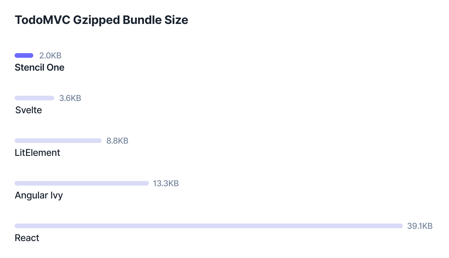 (Source: https://ionicframework.com/blog/introducing-stencil-one-1-0-0/)
If you’d like a more comprehensive analysis of these tools, I recommend this Stencil.js vs lit-element vs Vanilla vs Shadow DOM vs Vue.js comparison.
Organizing and sharing components with Storybook
Stencil’s ability to generate various output targets allows developers to build their code depending on how their application will be used. For example, as a distributed content website, web application, or third-party library
We’ve managed to combine that Stencil feature with Storybook, a technology for organizing components, and the result, our own Data4Life Web Components library. 🎉
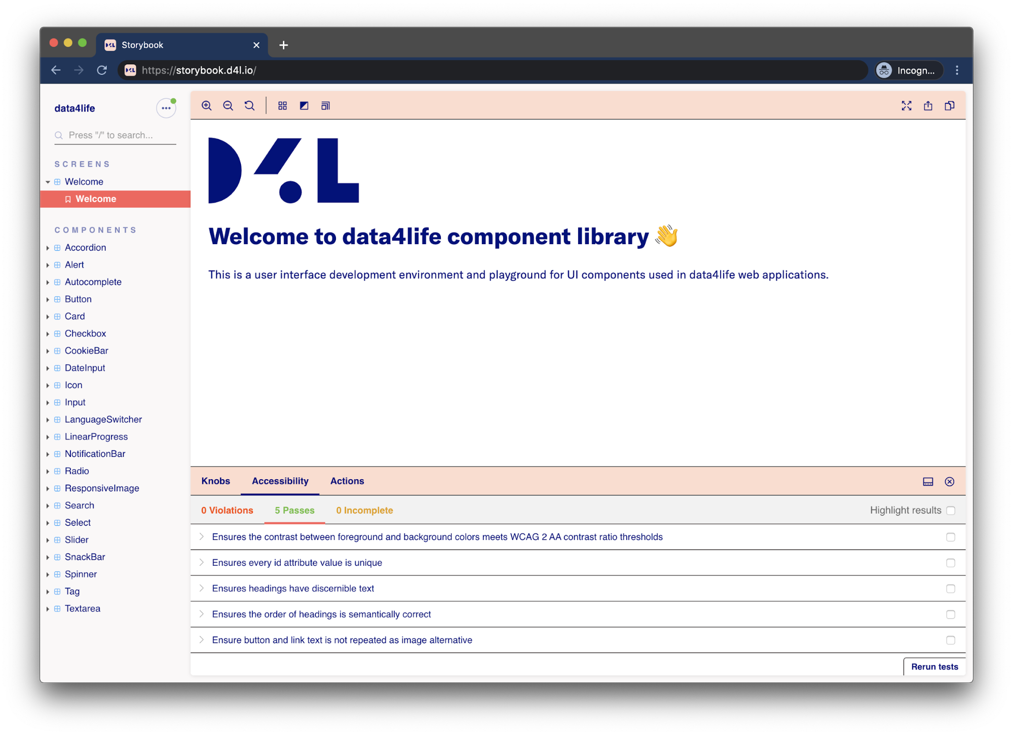
Storybook allows us to visualize and test different aspects of our components in a workshop environment. The visual representation of our library also serves as a communication bridge between our design, product, and front-end teams.
One of my favorite Storybook features is the add-on support and, specifically, the automated accessibility audits. Our component library's advanced functionality includes the following add-ons:
- Knobs: Exposes component properties and inputs for live editing of the components’ UI.
- Viewport: Checks the responsiveness on different viewports.
- Accessibility: Validates components against the WCAG specifications.
Our strategy for sharing components is using package management systems — in our case: npm. This way, we can reuse code snippets in several company web apps and websites.
From concept to final implementation
The biggest benefit we found when using Stencil and Storybook is how quickly they allowed us to create fully functional, accessible web applications. At the same time, we were able to focus on the essential aspects of our solutions, without sacrificing developer experience.
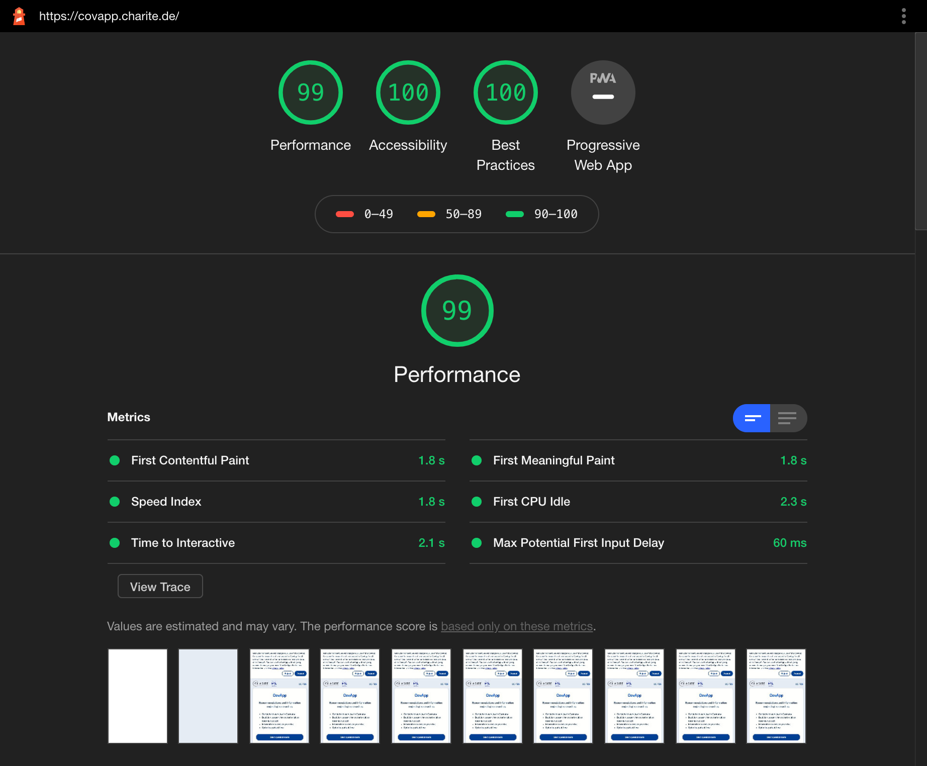
The real test arrived in our initiative with Berlin's Charité university hospital. We were tasked with creating an app that allowed people to answer questions about coronavirus (COVID-19) symptoms. After filling out the digital questionnaire, the user receives a recommendation, either to visit a hospital or stay home, as well as a personal symptom summary they can show a doctor.
Our time frame to develop this app? One week. The result: CovApp 🙌
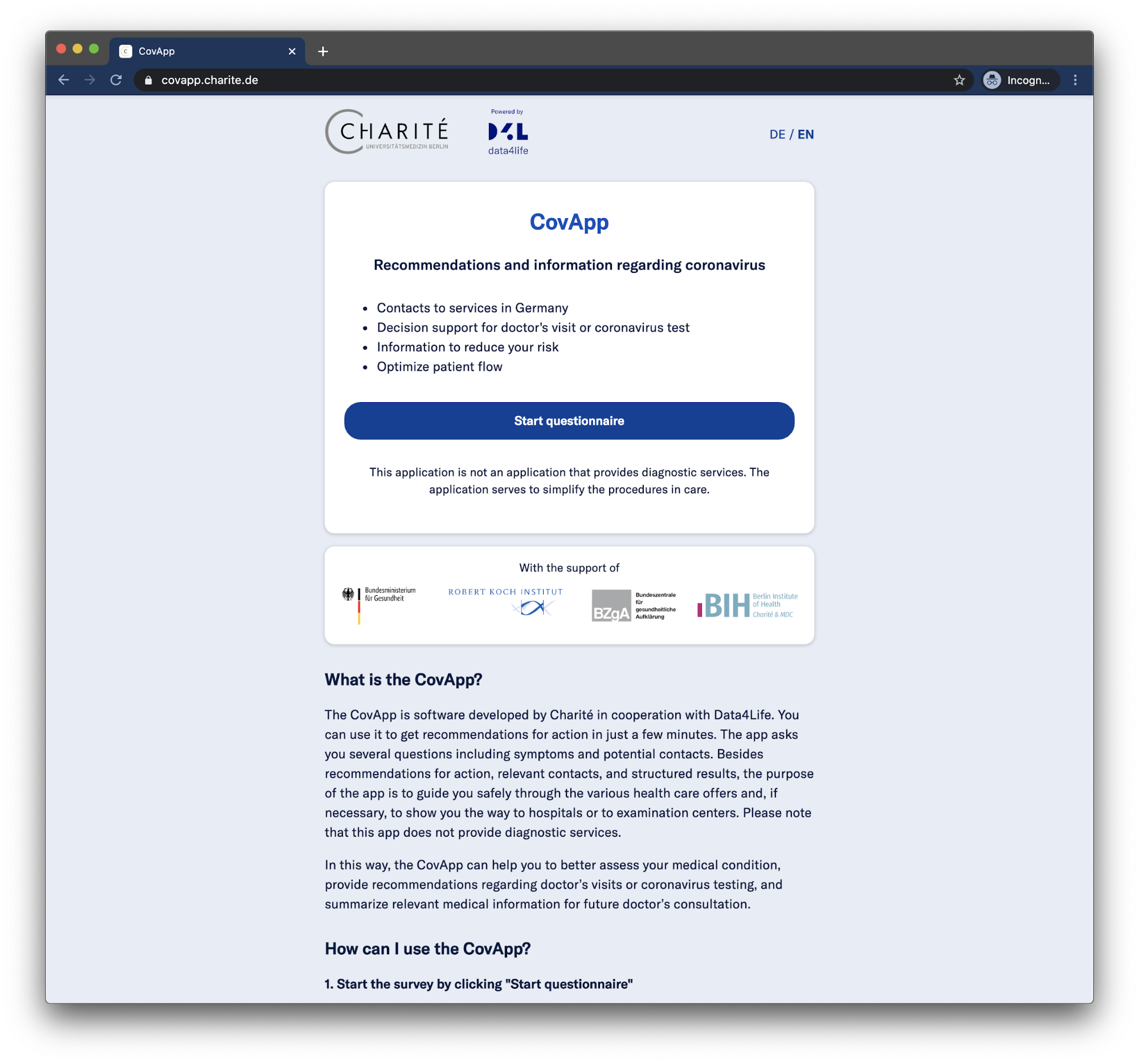
We built CovApp using our component library and Stencil for orchestrating the application’s specific views, templates, and logic (for example, decision tree, QR code generation).
We also open sourced CovApp and provided support for custom color palettes, logos, and languages.
Since performance and accessibility were topics we integrated into the development flow from the beginning, we achieved the desired perfect scores for the key performance metrics Time to Interactive (under 2.5 seconds on 3G/first load) and First Contentful Paint (under 2 seconds on 3G/first load).
Alongside the automated check processes, we conducted manual auditing on the semantic content structure, keyboard navigation, focus states, and meaningful announcements by voice-assistive technologies.
The CovApp project highlighted how important digital accessibility is in critical times – like during a pandemic – and why a fast and inclusive web application experience is essential.